Performance reports
About the page
The platform performance page is the most widely used and adopted page on the platform, providing valuable insights and analytics that enable users to better understand their monetization performance. With in-depth filters and helpful breakdowns, their Performance Reports provide the necessary granular data you need to make informed decisions to achieve monetization success.
My role
Product designer
Company
Unity Technologies
Team
Levelplay

Performance page design before the revamp (V1 design)

Performance page design after the revamp (V4 design)
Performance page design after the revamp (V4 design)

Performance reports page in Unity’s interface
Context & Challenge
Following the IronSource–Unity merger, there was a clear need for a unified design language and an upgraded technological infrastructure across existing reporting pages.
The legacy codebase made issue tracking challenging and hindered the development of new features that address users’ critical workflow pain points.
At the outset, several key features were missing, and the design system was outdated. As this is a core page of the platform, our goal was to improve usability and provide meaningful, practical features. Additionally, as part of the revamp, we looked at other reporting pages with the possibility of consolidating them. From this perspective, we decided to incorporate user activity metrics into the Performance page.
Goals
• Improve the UX of our reporting pages
• Support key product feature requests
• Revamp the platform using the V4 design system
Approach
We conducted extensive research into competitors with similar products, ensuring that our redesign would address user pain points and include features missing from other solutions.
User interviews were carried out to uncover pain points and gather requests for future features. We also created customer journey maps to better understand the user experience and identify key opportunities for improvement.
About the page
The platform performance page is the most widely used and adopted page on the platform, providing valuable insights and analytics that enable users to better understand their monetization performance. With in-depth filters and helpful breakdowns, their Performance Reports provide the necessary granular data you need to make informed decisions to achieve monetization success.
Context & Challenge
Following the IronSource–Unity merger, there was a clear need for a unified design language and an upgraded technological infrastructure across existing reporting pages. The legacy codebase made issue tracking challenging and hindered the development of new features that address users’ critical workflow pain points.
At the outset, several key features were missing, and the design system was outdated. As this is a core page of the platform, our goal was to improve usability and provide meaningful, practical features.Additionally, as part of the revamp, we looked at other reporting pages with the possibility of consolidating them. From this perspective, we decided to incorporate user activity metrics into the Performance page.
My role
Product designer
Team
Unity Levelplay
Brief
Page revamp
Goals
• Improve the UX of our reporting pages
• Support key product feature requests
• Revamp the platform using the V4 design system
Approach
We conducted extensive research into competitors with similar products, ensuring that our redesign would address user pain points and include features missing from other solutions.
User interviews were carried out to uncover pain points and gather requests for future features. We also created customer journey maps to better understand the user experience and identify key opportunities for improvement.

User flow
Solution & Added functionalities
A full redesign and rebuild of the Performance Reports page — Optimize automation capabilities to provide users with maximum value, and significantly improve usability through a cleaner, more intuitive UX.
-
Error states & Chip loader
-
New save reports feature that covers the metrics set feature
-
The page can be exported according to the selected setup
-
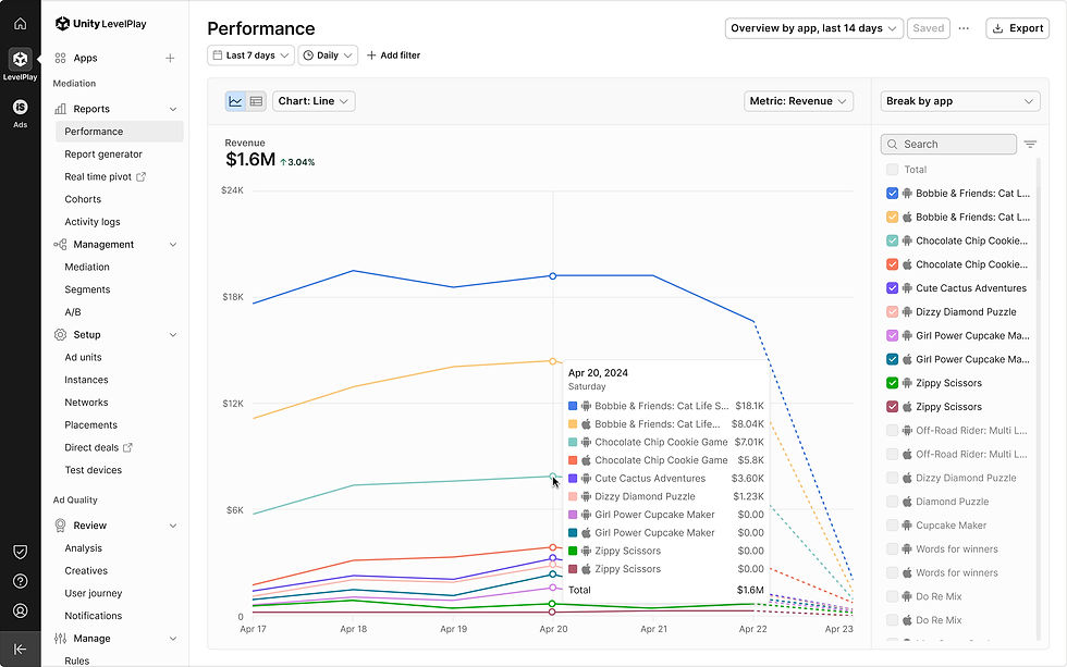
Filters & Display data in time buckets (None / Daily / Weekly / Monthly)
-
The page includes two view types (Chart / Table)
-
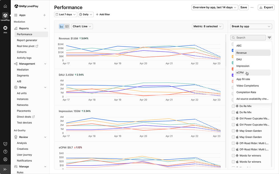
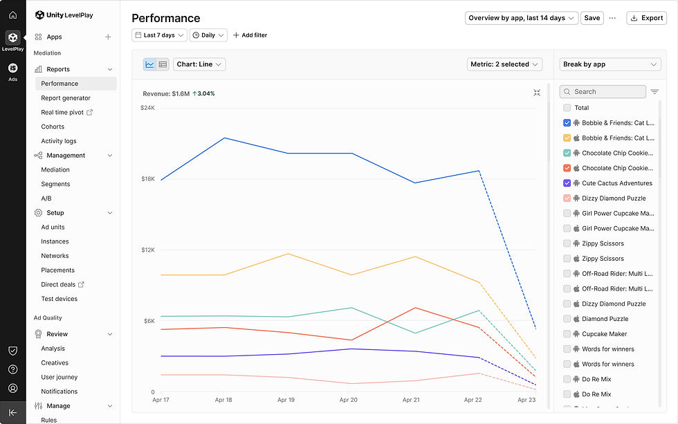
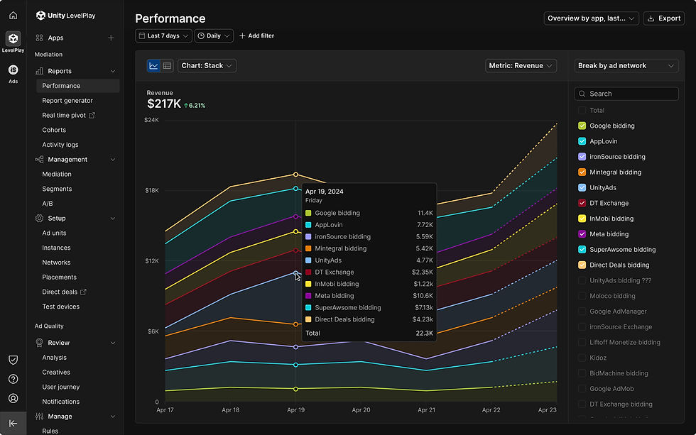
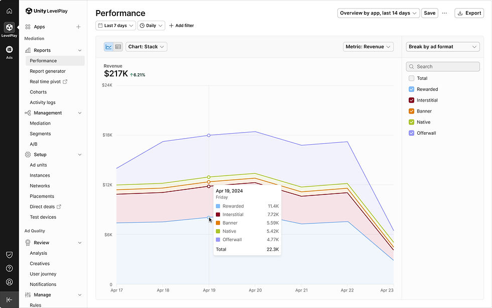
Chart - ability to see different chart types (Line / Bar / Stack)
-
View multiple charts across various metrics
-
Multiple metrics selection
-
Breakdowns
-
Sort according to selected metrics
-
Charts limitations
-
Table with additional functionalities (Break by Placement / Instance + Break by instance and offerwall)
-
Export according to selected metrics breakdowns and dates
-
Support ad unit filter and breakdowns
-
Updated chart line style and size
-
Brand-new chart color palette
-
Redesigned the Performance reports page for the ironSource network

Error states & Loaders | Error with the server (one chart layout)

Error states & Loaders | Error with the server (two charts layout)

Error states & Loaders | Chip loader (two charts layout)

Save report | Reports list

Save report | Save new report

Save report | Set as default

Filters | time interval: Daily, Weekly, Monthly (Chart view)

Filters | Date range: Monthly (Chart view)

Filters | Add filter Platform

Filters | Sorting_App condition

View | Chart default

View | Table default

View | Table_transition to table view

Charts | Line

Charts | Stack

Charts | Bar

Multiple charts across various metrics | 8 charts_Stack_hover
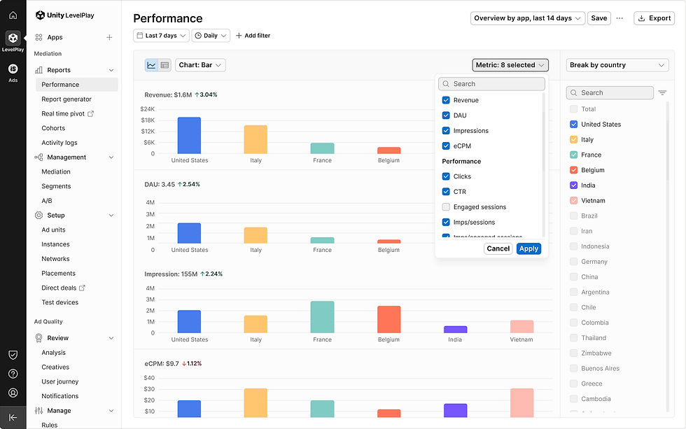
Multiple metrics selection | 8 selected

Breakdowns | Select at least 1 item
Sort according to selected metrics | 8 charts_Sort by Revenue by default

Charts limitations | Stack + Line charts_10 maximum

Charts limitations| Stack + Line charts_1 minmum

Charts limitations| Bar chart_6 maximum

Charts limitations | Bar chart_1 minmum

Table with additional functionalities | Break by app

Table with additional functionalities | Break by placement

Table with additional functionalities | Break by instance

Table with additional functionalities | Break by instance doesn't include offerwall

Table with additional functionalities | Break by instance doesn't include offerwall
Updated chart line style & max height size
User feedback indicated that the rounded chart lines made it difficult to identify trend changes. To improve clarity, we reverted to sharp lines and adjusted the chart dimensions, enhancing the visual readability of the data.
Future Suggestion: Add a collapsible or “grab” feature for the chart area to improve flexibility and user control.
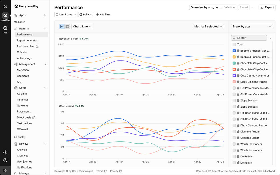
Chart line (Before & After) | Before_line chart

Chart line (Before & After) | After_line chart

Chart line (Before & After) | Before_stack chart

Chart line (Before & After) | After_stack chart

Collapse chart area | Expand chart area
Collapse chart area| Chart area expanded

Grab chart area | Expand chart area

Grab chart area | Chart area expanded
New chart color palette
The previous pastel-based palette lacked distinction and caused visual conflicts across data groups. To improve clarity, we introduced a sharper, more vibrant color system:
27 total colors, allocated as follows:
• 10 default chart colors (for items 1–10)
• Ad networks: 17 colors — 10 for bidding networks and 7 sub-colors for non-bidding networks
• Countries: 8 colors (from the existing palette)
• Ad formats: 5 colors (from the existing palette)
• A/B testing: 2 predefined colors (unchanged)
• Dark mode

New chart color palette
10 Default colors | Max items selected

Ad network colors | Sybo_Stack

Ad network colors | Sybo_Bar
Ad network colors | Sybo_Stack (Dark mode)

Ad network colors | Sybo_Bar (Dark mode)

Ad network colors | ironSource & UnityAds

Ad network colors | Home dashboard

Country colors
Ad format colors

A/B test colors
ironSource network

ironSource network | Filters_Add filter Ad format
